Friday’s Ultimate Website Refresh Guide: A Practical Roadmap for Nonprofit Leaders and Communications Teams
In today’s digital landscape, your website serves as the primary interface between your organization and its various stakeholders – donors, beneficiaries, partners, and volunteers. A well-designed, user-friendly website can significantly enhance your organization’s ability to communicate its mission, build trust, and engage supporters to take meaningful action. This guide is designed to help you navigate the complex process of creating or redesigning your organization’s website.
CONTENTS
- Preliminary Planning and Asset Inventory
- Site Navigation & Structure
- Homepage Strategy
- Clear & Purposeful Content
- Visual Design & Brand Consistency
- Accessibility & Inclusion
- Performance & Technical Considerations
- Taking the Next Step
1. Preliminary Planning and Asset Inventory
Before diving into the website building process, it’s crucial to take stock of your current assets, analyze competitors, and determine your technical needs. This groundwork will inform your design decisions, content strategy, and infrastructure choices to ensure a more effective and efficient website development process.
Have you conducted an inventory of your current digital and storytelling assets?
Conducting a content audit early in the process helps you organize information, spot challenges, and make informed decisions. Even for new projects, analyzing existing content provides valuable insights and builds on what already works.
To get started, create an inventory of your current resources. Use tools like Google Sheets or Airtable to catalog items such as images, testimonials, impact data, and bios in one place.
Have you analyzed competitor websites?
Reviewing competitor websites helps you understand how others in your field communicate their value and engage their audience. By studying their strengths, you can identify best practices that work well and spot areas where their user experience could improve.
Pay attention to common trends in messaging, design, and tone. This will help you pinpoint opportunities to differentiate your organization, whether it’s through a more compelling narrative, a unique visual style, or an improved user experience.
Have you determined your data collection needs and identified necessary automations or integrations?
Start by clearly outlining the types of data you need to collect on your website, such as newsletter sign-ups, contact form submissions, or donations. For each type of data, identify its purpose to ensure it aligns with your organization’s goals.
Explore automation tools like Zapier to streamline workflows and integrate your systems. Automating processes helps reduce manual work, improve efficiency, and minimize the risk of human error.
Have you considered the right content management system (CMS) such as Webflow or WordPress to support desired functionality and ease of ongoing edits to your website?
With so many content management systems (CMS) available, ranging from rigid out-of-the-box solutions to fully customized builds, finding the right fit can be challenging. To choose the best CMS for your organization, it’s important to assess your specific needs, such as ease of use, scalability, customization options, integration capabilities, and ongoing support requirements.
For most of the nonprofits we work with at Friday, we typically recommend Webflow or WordPress as starting points. These platforms are great options to consider as you explore your CMS options.
2. Site Navigation & Structure
An intuitive site structure lets your visitors easily find the information they need, whether they’re looking to donate, learn about your programs, or get involved. It is also a critical driver of your search engine optimization (SEO) strategy and is important to align on before developing content.
Are there clear pathways for different audiences and user goals?
Mapping out user flows ensures that visitors can easily achieve their goals, whether that’s donating, learning about programs, or getting involved. Tailoring navigation to different audience segments helps guide users through their specific journey.
Is the structure useful for both first-time and returning users?
Consider adding a search function for visitors who are looking for specific information. For repeat visitors, place common actions in familiar locations across pages to improve the user experience.
Does language reinforce key brand messaging while also being mindful of SEO keywords?
It can be challenging to align your brand language with strategic SEO keywords needed to increase your website’s searchability. Humans consume content much differently than search engines, so it’s important to think about what type of language is most appropriate to use for which audience, and in which places (e.g. your primary site navigation vs. a blog post vs. homepage copy).
3. Homepage Strategy
Your homepage is often the first impression visitors have of your organization. It should quickly communicate your mission, showcase your impact, and guide visitors to key actions that support your goals.
Does the homepage lead with a differentiated value proposition for your organization?
Craft a headline and subheading that immediately conveys your mission, values, and impact. Emphasize what sets your organization apart from others in your sector, focusing on your specific approach or outcomes.
Can someone who has never heard of your organization leave the page with a clear understanding of what you do and how they can engage?
When a first-time visitor lands on your website with no prior knowledge of your organization, it’s crucial they quickly grasp three key points: what you do, why it matters, and how they can engage. To ensure this, approach your site from their perspective: Is the content clear and intuitive? Is the navigation user-friendly? Does the page evoke trust or curiosity, encouraging further engagement?
Are impact statistics, testimonials, and/or success stories featured to build credibility?
Display this content near your CTAs to inspire visitors to take action.
- Helpful Resource: View Friday’s tips on impactful storytelling: #1, #2, #3, #4
- Helpful Resource: Structured Storytelling: 5 Ways to Deliver More Engaging Content (Friday)
Are there prominent calls-to-action for your most important conversion goals (e.g., “Donate Now”, “Volunteer”)?
Feature key calls-to-action (CTAs) like “Donate Now” or “Get Involved” prominently in the hero section to ensure they are easily accessible. Use action-oriented language that clearly communicates the impact users will have by supporting your organization.
For inspiration, refer to Friday’s Roble case study, which demonstrates how aligning website messaging with clear CTAs can drive engagement and conversion.
4. Clear & Purposeful Content
Your website content directly reflects your organization’s mission and values. Make sure that your key messages resonate with your target audiences – including donors, beneficiaries, and partners – to drive engagement and support.
Does each page clearly address a specific audience segment (e.g., donors, volunteers, beneficiaries)?
Customize the content and calls-to-action (CTAs) to speak directly to the needs and motivations of each group, using language, visuals, and messaging that align with their interests.
- Tool: Use Google Analytics to set up audience segments and track engagement.
- Helpful Resource: Use Friday’s Stakeholder Communications Map to define messages for each audience segment.
Is there a consistent brand voice across all content?
Develop brand guidelines that outline your tone, style, and key messaging. Apply these consistently across all content to ensure a unified voice, whether it’s formal, inspirational, or conversational. Regularly review new content to ensure it aligns with your established voice.
- Helpful Resource: Friday’s 5 Branding Tips for Reaching Nonprofit Audiences.
Are you using intentional cross-linking between pages to support ideal user journeys?
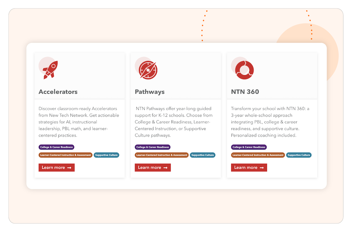
Create clear, logical pathways between pages by linking related content or actions (e.g., “Learn More” buttons leading to program details). Ensure that cross-links support your audience’s goals and promote a seamless journey through your site, from introductory content to more specific actions like donating or signing up.
Is your website content structured consistently for easy scanning (headings, bullet points, short paragraphs)?
Break content into short, scannable sections with clear headings, bullet points, and concise paragraphs. Use visuals or icons to highlight key points and make it easy for users to quickly understand your message.
- Tool: Use the Hemingway Editor to check readability and structure.
5. Visual Design & Brand Consistency
A cohesive visual design reinforces your brand identity and builds trust with your audience. It should reflect your organization’s values and create an emotional connection with visitors.
Are the color scheme, imagery, button style, and font consistent and aligned with your brand guidelines?
Develop a style guide that specifies colors, fonts, button styles, and imagery preferences to maintain visual coherence across the site. Stick to a limited color palette that aligns with your brand and avoids overwhelming users with too many variations.
Are high-quality, authentic images used to showcase your work and impact?
Showcase real, high-quality images that reflect the impact of your work and resonate with your mission. Avoid generic or staged stock photos. Choose images that feel authentic and connect emotionally with your audience.
Do headings and button styles create a clear hierarchy of information?
Establish clear spacing rules for margins, padding, and line spacing to avoid visual clutter. Use white space around text, images, and CTAs to improve readability and create a clean, modern layout.
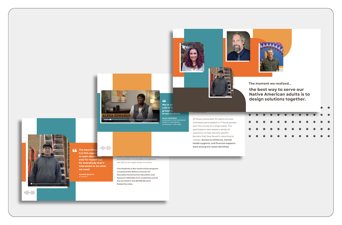
- Resource: Refer to Friday’s Roble case study to see how we used clean visuals and white space to modernize the website.
Do visual cues signal when you are transitioning from one section of a page to another and encourage continued scrolling?
Use visual cues like background color changes, dividing lines, or subtle animations to signal transitions between sections. These cues should guide users smoothly through the page, encouraging continued scrolling without disrupting the flow.
Is the design responsive and mobile-friendly for users on all devices and browsers?
Test your website’s design and functionality across different screen sizes and devices to ensure it looks great everywhere. Ensure buttons are clickable, text is readable, and visuals adjust appropriately on both mobile and desktop. Also, check compatibility across various browsers (e.g., Chrome, Safari, Firefox) to ensure consistent performance.
6. Accessibility & Inclusion
Ensuring your website is accessible demonstrates your commitment to inclusion and expands your potential audience. Remember: it’s not just about compliance, it’s about living your values and reaching everyone who might benefit from or support your cause.
Has the site been tested with an accessibility checker?
To ensure your website is accessible to all users, start by running it through an accessibility checker to identify potential barriers, such as issues with color contrast or missing alt text. Review the reports and address any flagged issues to enhance the user experience. Additionally, test keyboard navigation to ensure your site is usable for visitors with motor impairments.
- Tool: Web Accessibility Checker Browser Extension
- Tip: Use the TAB key to navigate your site and verify that all interactive elements are fully accessible.
Is there sufficient color contrast and font size for text and important elements?
Make sure text and important elements meet accessibility standards for color contrast (at least 4.5:1 for normal text and 3:1 for large text). Additionally, verify that font sizes are large enough to read without zooming, especially for body text and CTAs.
- Tool: WebAIM Color Contrast Checker
- Resource: How to Pick the Perfect Font Size (A11y)
Are all images and videos accompanied by descriptive alt text and captions?
Include alt text for all images that clearly describe their content or purpose. For videos, ensure captions are available, especially if the content includes important information or instructions.
- Tool: WebAIM Guide on Alternative Text
- Tip: Upload your videos to YouTube and use YouTube’s auto-caption feature to ensure accessibility.
Are you using a tool that allows users to customize the site for their individual needs?
Consider using an accessibility tool like accessiBe to allow users to customize the site for their unique needs. These tools offer options to adjust settings such as contrast, text size, and cursor size, providing a more inclusive experience for users with different accessibility requirements.
7. Performance & Technical Considerations
In order to maintain visitor engagement and support your digital campaigns, your website needs to be fast and reliable. Poor performance can lead to frustration and lost opportunities for engagement.
Has the site been tested for load speed across various devices and connections?
Optimize elements like large images or uncompressed files that may be slowing down the site.
Are analytics tools in place to track key performance indicators (KPIs)?
Set up analytics to track important metrics like user engagement, conversions, bounce rate, and session duration. Regularly review these insights to help make informed decisions that improve the user experience and help you meet your goals.
- Tools: Google Analytics
Is the site secure (HTTPS) to protect user data, especially for donations?
Use an SSL certificate to secure your website with HTTPS. This encrypts data and ensures that users feel confident about interacting with your site, especially during sensitive activities like donations.
- Tool: Let’s Encrypt for free SSL certificates
Is there a disaster recovery plan in case of website outages or data loss?
Prepare a disaster recovery plan that includes regular backups of your website data, contact details for technical support, and a clear action plan for restoring the site if it goes down or data is lost.
Do you have a privacy policy?
Draft a clear privacy policy that explains what data you collect, how it’s used, and the measures taken to protect it. Display the privacy policy in a prominent, accessible location, typically in the footer, to ensure transparency and compliance with data protection laws.
Are you adhering to cookie and tracking policies?
Implement a cookie consent banner or pop-up that informs visitors about the use of cookies and tracking on your site, and allows them to adjust settings. Ensure compliance with relevant regulations such as GDPR or CCPA by giving users control over cookie preferences.
Considering a refresh for your organization’s website?
A website refresh is an exciting opportunity to enhance your online presence, but we understand there are many details to consider. At Friday, we’re here to make the process seamless and stress-free. Our team manages everything from the technical backend to creating an engaging user experience, ensuring your website reflects your mission, strengthens your brand, and connects with your audience. Ready to get started? Contact us for a free consultation, and let’s bring your vision to life.